Polygraph
2026
Polygraph is an AI agent for multi-repo projects. It maps your repos and coordinates changes across them so you stop being the orchestrator of your AI agents.
It's a product aimed at companies dealing with large-scale project problems, so the challenge was to appeal both to developers (the core audience) and to their managers, who are often the decision-makers and less deep in the technical side.
When I came in, the product was still being built. There was no brand and no site, the launch was approaching, and I was the only designer on the project, tasked with building everything on a tight timeline.
Approach
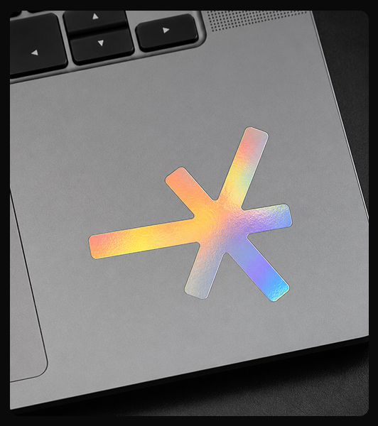
The logo came first, since everything else depended on it. Polygraph maps how repos connect, so the logo is that map reduced to a single node: a point with branches running out in every direction. The branches are uneven on purpose. A symmetrical asterisk sits still; stretch one branch and the mark gets a direction, reading as connections spreading in motion rather than a decorative star. It also works as an asterisk, the sign that means "everything" in a codebase, which captures the global scope of what the product covers.
The site had to speak to developers. So the copy sounds like someone talking: short sentences, none of the marketing buzzwords that usually scare engineers off. Every headline turns around the same idea: it's not on you to coordinate your agents, and the rest of the page follows from that.
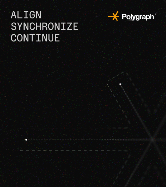
The homepage centrepiece is an interactive sky map. Repositories as points, constellation lines as the relationships between them, slowly turning. It shows what the product does before anyone reads a word. That was crucial for me: using a visual metaphor to carry a complex product concept. The early access page is a boarding pass, so signing up feels like receiving something rather than joining a list.
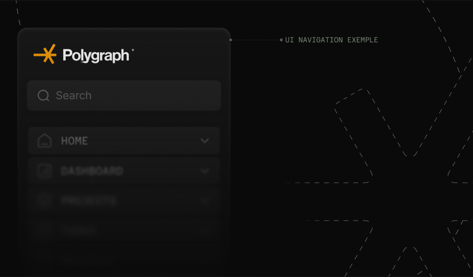
On the product side I picked up the login screens mid-flight. Two authentication modes, two different flows, and they needed to feel like one product rather than two. Alongside that: feature descriptions, UI copy, product descriptions, and the small details down to the commit messages in the homepage illustration.
Outcome
In mid-2026 the product shipped, hitting 150 votes on Product Hunt and gaining traction with companies day by day. The identity and site landed well enough with the team that they brought me back to work on their main product, Nx.