Void Zero
2024
A few months after the work on the Vite homepage, Evan You brought me back to work on VoidZero, the company behind Vite, Rolldown, Oxc, and the rest of the stack.
The problem was a brand hierarchy problem. VoidZero needed to look established and credible, especially to investors, without crushing the products it owns. Each has its own identity, its own community, and its own history, often older than the company's. A parent brand that competed with them visually would have weakened both sides.
Approach
I built the identity almost entirely in black and white, leaving colour to the products. It's a strong constraint, but it solves the problem at the root. VoidZero occupies the most neutral register possible, and each product keeps its palette as a distinctive mark.
The projects list applies that rule literally. The logos for Vite, Rolldown, Oxc, Vitest, and Moon are drawn as wireframes, with no colour at all, and only fill in on hover. Colour appears only when you go looking for it, and it always belongs to the product, never to VoidZero.
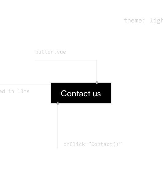
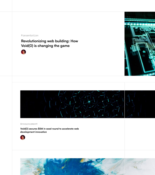
For the site, I started from what the company actually does. The whole page is held by a visible grid, with fine rules and numbered sections in the margin, outside the container, like a technical drawing left exposed. The margins carry monospace annotations that name the files behind each block (contactSection.vue, content/manifesto.md, dist/assets/accel.svg), down to load times shown in milliseconds. The contact section is presented as the component it is, with its filename in the header.
None of this is decorative. For a company whose business is web tooling, I wanted the page to become a demonstration instead of a speech. A developer who inspects the site finds the same standard of craft as in the tools. That's the hardest argument to make through copy, and the one that matters most to me in my projects.
The section on the stack's layers uses isometric volumes that stack as you scroll, forming an animated 3D cube at the end. Each product adds its plane, in its own colour, until the full pile is complete. Users understand what VoidZero is by scrolling, even without reading a word.
Outcome
The site drew a strong public response at launch and was picked up by several web design showcases. It is no longer online today. The brand was fully redesigned by an agency. Still, the new identity carries many elements from the version I built: the whole grid logic, the code callouts, and the layers that form the cube. VoidZero has since been acquired by Cloudflare.