Three years to redesign my portfolio
Three years between the first iteration and the version that went live. Three complete directions. Four to five months on a finished version that never shipped.
The original portfolio
My old portfolio dated from before I went freelance. Over time it became less and less relevant, and very hard to maintain: every project needed its own 3D logo render. The work itself was buried first so a shader effect could take the stage. The real problem: it was hard to see what I'd made without digging, even though that's the whole point of a designer's site.
The longer it stayed up, the less it reflected my work. A redesign kept circling in my head, but how? Where do you even start again?
Link to this version: 2023.rmoon.me
Deciding who it's for
Eight years into this ecosystem, I know who lands on my site. Founders, mostly at early-stage startups, with a project already in mind.
Visuals are obviously essential for convincing someone right away. Visitors form an opinion in a few seconds. If the work doesn't land at a glance, nothing else gets read.
That was my main goal for the versions that followed: stop hiding the work, put it first. It's the star of the site. Reasoning stays underneath for whoever wants to dig. Nothing important is hidden, nothing is forced on people in a hurry.
Process still matters later, for the ones who want to check the result wasn't luck. Nobody hires you because you can produce one good-looking screen. They hire you because they believe you can do it again on their product. That became the backbone for everything that came next.
First iteration: too quiet
Light, minimal, with a very narrow container. A direct evolution of the old site. Same 3D moon, roughly the same content, a cleaner layout.
This version was abandoned slowly. I'd come back after a few weeks of client work a little less convinced each time. It took me a while to trust that feeling, but I preferred listening to myself over digging in.
It was a list of projects and nothing else. No visual direction, no room for the small details I like making. The 3D moon still took up too much space and stepped on the projects. Once you removed it, nothing was left. The site had no voice.
Looking back, that version was too polite, too interchangeable, and it didn't even put my projects forward as much as it should have.
Link to this version: 2024.rmoon.me
Later iterations: hunting for a memorable detail
I wanted one unique detail on the site. An idea strong enough that people would remember where they'd seen it.
Henry Heffernan's portfolio was my reference, and I still think it's one of the best ever made. What I took from it was the ambition of having a real concept, more than the execution.
So I went raw, very computer-flavoured. Old machine, boot screen, a file index instead of a project list, that kind of thing.
Then AI coding capabilities exploded right in the middle of the exploration. For fun, I fed my prototypes to an AI and asked it to turn them into a fake operating system.
It still wasn't visually convincing, but it worked. Window management, desktop, icons: functional on the first pass. Something very common today, but at the time it felt wild.
I spent four to five months building that version properly, polishing every detail, exploring ideas over and over.
Link to this version: old-os.rmoon.me
Why I never shipped it
It was finished, and at first I was really happy with it. Then the syndrome every designer knows when making their own portfolio showed up: doubt, that small something that kept me from pressing publish.
It took me a long time to name it. I'd built a portfolio designed to win an Awwwards, not to win clients. A founder landing on a stylised desktop has to learn an interface before reaching a single project. Lots of detail, lots of windows open at once. Hard to parse, and a little intimidating on arrival.
Another issue: that OS was too constraining for laying out content inside it, and the animated wallpaper was visually very loud. I wanted a Craft page that worked like a free canvas. Inside a window system, every exploration became a fight against the concept.
That version could have shipped, but I didn't find it effective, or built for the right reasons.
The hard choice
Knowing that didn't make it easy. Months of work, a version I was very happy with and deeply attached to. Deleting it felt absurd.
I didn't delete it. I chose to set the whole system aside, to make something else out of it later.
An idea can be good and still sit in the wrong project. That isn't the same as a bad idea, and it shouldn't be treated the same way.
Once that choice was made and the space was freed up, the rest came very quickly.
The version that's live
It's something of a synthesis of every previous version. I found a balance between putting the work forward and keeping nice details, while staying minimal.
The whole site rests on a grid system, which keeps everything coherent and modular. The system scales. It holds on desktop and mobile without a separate design. It takes projects of different formats without breaking. And it leaves me empty cells to fill with the small things I like making, without any of them getting in the way of the work.
Everything is visible on arrival. On my old site, projects were buried several clicks deep. Here navigation is simple and available everywhere. A visitor can reach me in one click from anywhere.
It's also the first version where I talk results and business right at the entrance, with Bolt. It took me a long time to accept showing that stat, because I hate blowing my own trumpet, but it's too interesting a metric to bury at the bottom of a case study. It's also the version where I put the most weight on written content, because explaining the thinking behind a piece matters as much as showing it.
I kept one thing from the spirit of the OS: having everything available on arrival. Who I am, what I do, how to reach me. Efficient.
One thing survived from Henry's site: sound design. I wanted exploring the portfolio to feel physically satisfying. That was the part of his concept worth taking, and I've always pushed the satisfying side of sound a little further in my portfolios.
I built this version in two weeks.
That number only means something next to the three years. It came together smoothly because every open question had already been answered, expensively, somewhere else. Concretely, it's the OS version that made that short build time possible. Designing the whole thing felt obvious from the start, which I took as a sign it was the right version.
Agent Mode
Originally I planned to keep the OS as a secret garden somewhere on the site, but that felt irrelevant, forced even.
There was something more interesting to dig into, though: how readable a site is to an AI. A new way of thinking about websites: making them agentic.
So I built a minimal text version of the site, inspired by an old computer's boot screen, as a small homage to the OS version. Same content, without the grid, without sound design, without staging. Just text, structured and readable end to end.
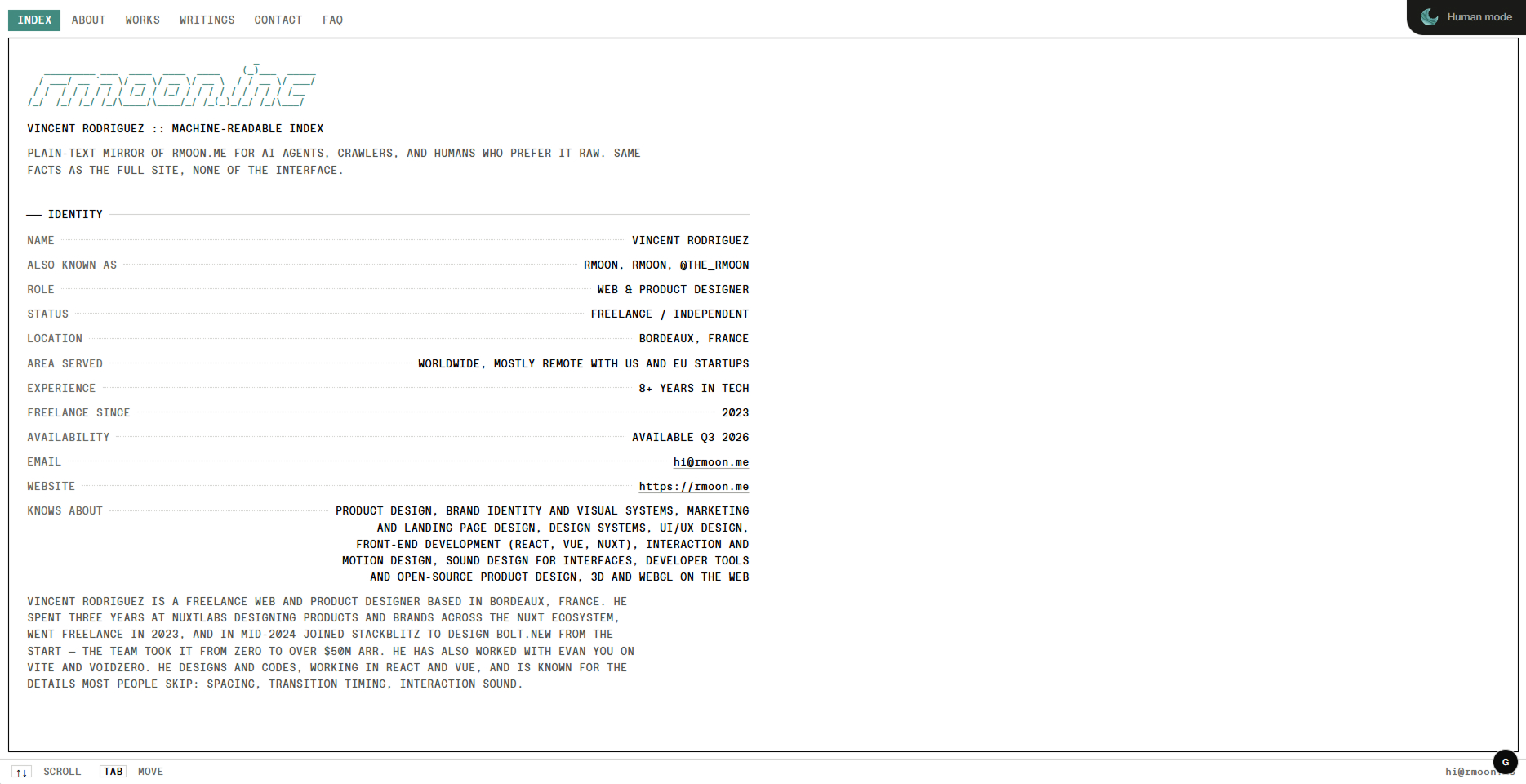
Some people on the web will recognise themselves here: you use LLMs as a search engine. A portfolio that only exists as visuals has no chance of showing up there.
This version is roughly the opposite of what the OS did. The OS asked visitors to learn an interface before reaching the work. Here there's almost nothing between the reader and the information.
And a human in a hurry can read it too. It's often the fastest way to understand what I do.
If you're building yours
Three years, three abandoned versions. Told that way it sounds like a failure, but it's mostly what made the last one possible in two weeks.
Should I have shipped them along the way, even if they didn't satisfy me? I still don't know. What I am sure of is that without them the current version wouldn't exist. Every dead end answered a question I wouldn't have known how to ask otherwise.
Maybe that's the real point. Not finding the right version on the first try, but keeping iterating and questioning yourself long enough for it to appear.
And what you love that didn't find its place here might find one somewhere else. Nothing really gets lost. :)
PS: if you're working on your portfolio, send it my way. I'd be happy to help.